안녕하세요! Class 문을 활용하여 텍스트 형식의 WMAP 데이터 다루기 (천문학 데이터 분석 입문) 3탄으로 돌아왔습니다!
이전 과정들은 아래 링크로 첨부해두었으니 참고 부탁드립니다. ^^
https://himbopsa.tistory.com/50
[Python Class 구문 입문] Class 문을 활용하여 텍스트 형식의 WMAP 데이터 다루기 (천문학 데이터 분석
안녕하세요, AstroPenguin입니다! 2탄인 텍스트(.txt) 형식으로 된 WMAP데이터를 통하여 CMB의 Angular Power Spectrum 그래프를 그려낸 게시물로 먼저 찾아뵙고, 순서를 바꾸어 python으로 class구문을 작성하는.
himbopsa.tistory.com
https://himbopsa.tistory.com/49
[Python(파이썬) 텍스트(.txt) 형식 천문학 데이터 다루기] Class 문을 활용하여 텍스트 형식의 WMAP 데
안녕하세요, 거의 1년만에 새로운 글로 찾아뵙게 되었습니다. 학생회장과 학부연구생, 대외활동으로 블로그에 글을 쓰지 못하였습니다. 작년 또한 마찬가지로 파이썬으로 천문학 공부를 해보았
himbopsa.tistory.com
이전 과정들에서 x축 값인 1, 10, 100, 1000의 간격이 실제 숫자 간격에 맞게 배치되어있으나 궁극적으로 만들고자 하였던 그래프에서는 1, 10, 100, 1000의 간격이 모두 똑같게 배치되어있기에 그리고자 하는 모양과 실제 모양이 달라진 아쉬움을 극복하는 과정으로 찾아뵙게 되었습니다. 저는 여기서 트릭을 살짝 사용하였습니다.
그 트릭을 예를 들어 설명하자면 x1 = [1,5,10,100,1000]의 array를 같은 간격으로 표시하기 위해서
임의로 x2 = [0,1,2,3,4]의 array를 생성하여 x1 대신에 x2를 plot의 x축 값으로 두어 그래프를 그리는 것입니다.
이를 그림으로 표현하면 다음과 같습니다.

x2로 만들어진 배열에 plt.xticks([0,1,2,3,4], ['1','5','10','100','1000'])를 적어넣어 그래프 내에서 균일한 간격을 가진 위치에 원래의 값을 문자의 형태로 이름붙여주는 방식을 거치면 서로 다른 간격의 값들이어도 그래프 상에는 서로 같은 간격을 가지게끔 나타낼 수 있습니다. 그리고 이를 WMAP 클래스에 적용하면 다음과 같습니다. Angular_Spectrum_plot 함수를 다음과 같이 고쳐주어야 합니다.
    def Angular_Spectrum_plot(self): # multipole momentum의 간격이 일정한 그래프를 그리는 코드
        x = np.array(self.multipole_moment)
        y = np.array(self.real_WMAP_power())
        x_point = range(len(y))
        self.size = 20

        plt.figure(figsize=(11,7))
        plt.errorbar(x_point,y,yerr=self.power_err,c='red')
        plt.scatter(x_point,y,c='black',s=30,marker='d')
        plt.title('The CMB Angular Spectrum', fontsize = self.size)
        plt.xlabel('Multipole Moment (l)', fontsize = self.size)
        plt.ylabel(r"$\Delta T$" +" " + r"[$\mu K^2$]", fontsize = self.size)
        plt.xticks([3,15,31,41], ['10','100','500','1000'],fontsize = self.size)
        plt.yticks([1000*(y) for y in range(7)], fontsize = self.size)
        plt.show()
이러한 수정을 거쳐 그래프를 다시 그리면 다음과 같습니다.


저는 이 곳에서 Multipole Moment을 Angular Scale로 나타내어 두 그래프에 각도와 Multipole Moment 전부를 볼 수 있게 코드를 더 수정하였습니다. 이 때 Angular Scale(degree) = 180(degree) / 10^Multipole Moment (I)으로 Angular Scale란 180도를 10의 Multipole Moment (I)승으로 나누어준 값을 의미합니다. 이는 추후에 그래프 분석에 큰 역할을 합니다.
###최종 수정 코드###
class WMAP():
def __init__(self):
self.multipole_moment = []
self.TT_power_spec = []
self.power_err = []
def readfile(self, filename): # 텍스트 형식의 파일을 여는 코드
try:
file = open(filename,'r')
del_2nd_row = file.readline()
for line in file:
line = line.strip()
columns = line.split()
self.multipole_moment.append(float(columns[0]))
self.TT_power_spec.append(float(columns[3]))
self.power_err.append(float(columns[6]))
file.close()
except:
print('FileNotFoundError : Please check your filename')
def real_WMAP_power(self): # 오차를 빼서 정확한 값을 찾는 코드
observated_value = np.array(self.TT_power_spec)
error_value = np.array(self.power_err)
real_value = observated_value - error_value
return real_value
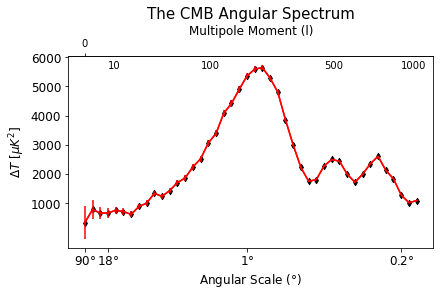
def Angular_Spectrum_plot(self): # 그래프를 그리는 코드(최종)
x = np.array(self.multipole_moment)
y = np.array(self.real_WMAP_power())
x_point = range(len(y))
self.title = 15
self.size = 12
fig, ax = plt.subplots(constrained_layout=True)
ax.plot(x_point,y, c = 'r')
ax.set_xlabel(r"Angular Scale ($\degree$)", fontsize = self.size)
ax.set_ylabel(r"$\Delta T$" +" " + r"[$\mu K^2$]", fontsize = self.size)
def l_to_degree(x):
angle = 180./x
return angle
def degree_to_l(x):
l = 180./x
return l
secax = ax.secondary_xaxis('top')#, functions=(l_to_degree, degree_to_l))
secax.set_xlabel('Multipole Moment (l)', fontsize = self.size)
secax.set_xticks([0])
plt.errorbar(x_point,y,yerr=self.power_err,c='red')
plt.scatter(x_point,y,c='black',s=20,marker='d')
plt.title('The CMB Angular Spectrum', fontsize = self.title)
#plt.xlabel('Multipole Moment (l)', fontsize = self.size)
plt.ylabel(r"$\Delta T$" +" " + r"[$\mu K^2$]", fontsize = self.size)
plt.xticks([0,3,21,41], labels=[r"90$\degree$",r"18$\degree$",r"1$\degree$",r"0.2$\degree$"], fontsize = self.size)
plt.yticks([1000*(y+1) for y in range(6)], fontsize = self.size)
plt.text(3,5600,'10')
plt.text(15,5600,'100')
plt.text(31,5600,'500')
plt.text(41,5600,'1000')
plt.show()
# r"{$l(l+1)\C_1/2\pi$}"
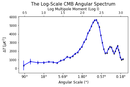
def log10_Angular_Spectrum_plot(self): # 로그 스케일의 그래프를 그리는 코드(최종)
x = np.log10(np.array(self.multipole_moment))
y = np.array(self.real_WMAP_power())
self.title = 15
self.size = 12
fig, ax = plt.subplots(constrained_layout=True)
ax.plot(x,y, c = 'b')
ax.set_xlabel(r"Angular Scale ($\degree$)", fontsize = self.size)
ax.set_ylabel(r"$\Delta T$" +" " + r"[$\mu K^2$]", fontsize = self.size)
def l_to_degree(x):
angle = 180./(10**x)
return angle
secax = ax.secondary_xaxis('top')
secax.set_xlabel('Log Multipole Moment (Log l)', fontsize = self.size)
plt.errorbar(x,y,yerr=self.power_err,c='b')
plt.scatter(x,y,c='black',s=20,marker='d')
plt.title('The Log-Scale CMB Angular Spectrum', fontsize = self.title)
plt.xticks(np.arange(0.5, 3.5, 0.5), labels=[r"90$\degree$",r"18$\degree$",r"5.69$\degree$",r"1.80$\degree$",r"0.57$\degree$", r"0.18$\degree$"], fontsize = self.size)
plt.show()
WMAP = WMAP()
WMAP.readfile('WMAP_TT_power_spec.txt')
WMAP.Angular_Spectrum_plot()
WMAP.log10_Angular_Spectrum_plot()수정된 코드로 그려진 결과물은 다음과 같고 제가 궁극적으로 원하던 그래프와 거의 유사한 형태를 보임을 알 수 있습니다. 그렇다면 이 그래프가 뜻하는 바는 무엇일까요? 이에 대해서는 분량이 너무 길어져 다음 게시물로 찾아뵙도록 하겠습니다. 읽어주셔서 감사합니다.